This style became widely synonymous with the “look” of many Swiss cultural institutions which used posters as advertising vehicles. The sachplakat, object poster, became the leading style for Swiss product posters during and immediately following World War II.
Early 1950's Advertising (ITS not implemented in examples)
Still using illustrations, over saturated colors, over crowding of text, and somewhat of a grid system.
Magazines such as Vogue and McCall's had significant influences over the years of Swiss Style.
Early 1950's Advertising (ITS not implemented in examples)
Still using illustrations, over saturated colors, over crowding of text, and somewhat of a grid system.
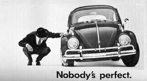
1960s Advertising
Use of photography and type together in a simple clean gridded manner.
Magazines such as Vogue and McCall's had significant influences over the years of Swiss Style.
The new style was perfectly suited to the increasingly global postwar marketplace. There was a strong need for clarity in word and symbol. Corporations needed international identification, and global events such as the Olympics called for universal solutions which the Typographic Style could provide.
Helvetica is used on a number of signage, labels, ad posters etc.


